Rainbow Bridge 2.0 Design Details
In this article, we're excited to share with you some of the design considerations that went into the new Rainbow Bridge 2.0!
The Rainbow Bridge is the official bridge for transferring tokens between the Ethereum, NEAR and Aurora blockchains.
The original version 1.0 supported transfers only between Ethereum and NEAR, and when later extended to support Aurora, some limitations surfaced that prompted us to conduct a redesign. This article discusses some of the design decisions and details that went into the all-new, recently-launched, Rainbow Bridge 2.0.
Product unification
Version 1.0 of the bridge lived on the domain name, ethereum.bridgetonear.org. When Aurora support was added, that bridge then lived separately on aurora.bridgetonear.org. Multiple products, on separate domains, clearly isn't ideal from UX or scalability perspectives.
For 2.0, we unified everything into a single product that runs on the memorable domain, rainbowbridge.app. Within its single interface, the bridge now supports transfers between any of the supported networks.
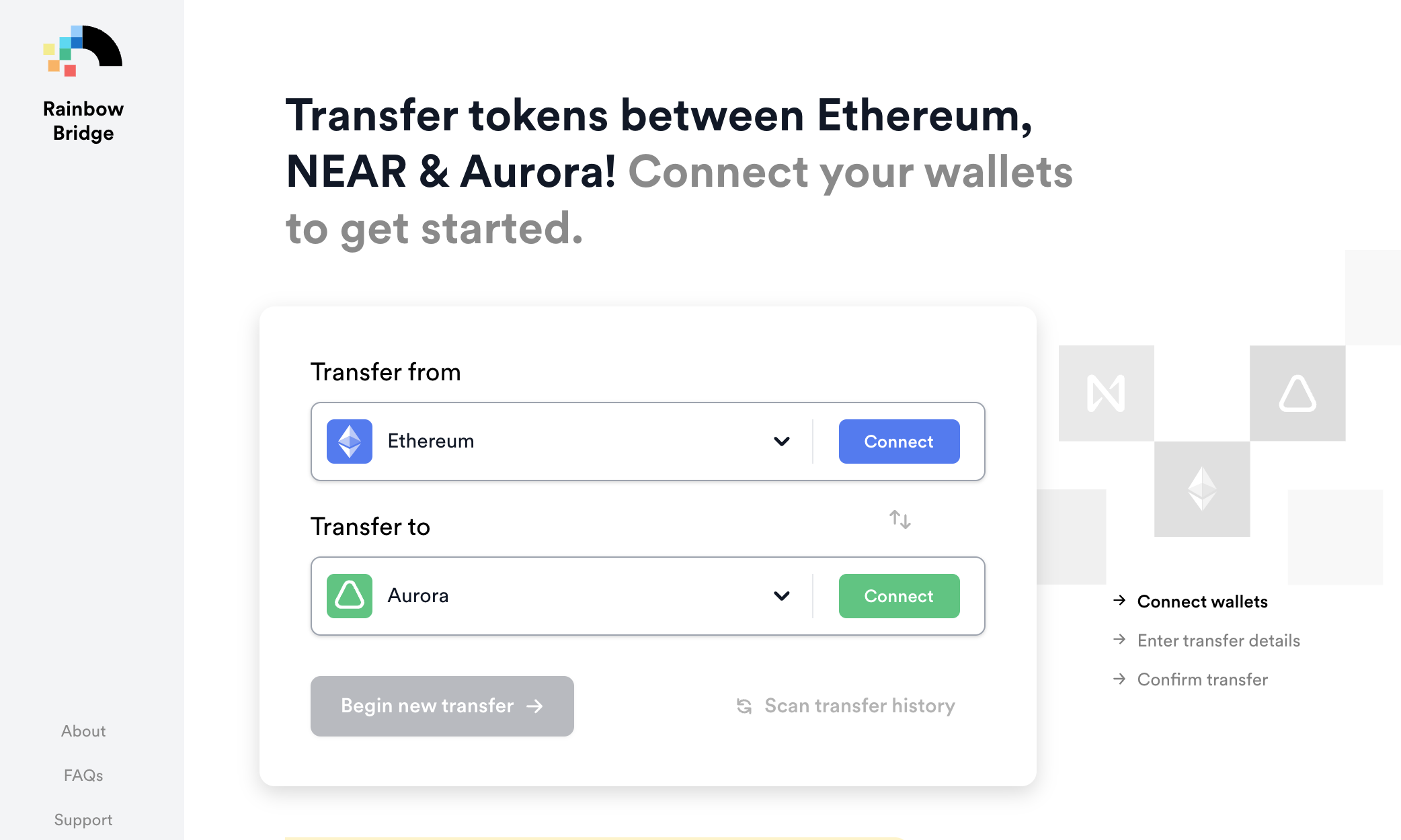
This approach opens the door to easily adding support for even more networks. For example, an external team recently built connectors to the Binance Smart Chain, which we plan to soon integrate into the Rainbow Bridge 2.0.
Technical architecture
We created the Rainbow Bridge 2.0 by integrating our light-clients into a Next.js application, supported with a headless CMS (content management system).
Using the external CMS allows non-technical people to manage some of the product UI copy, and allows for some neat programatic things like context-sensitive FAQs that only appear in the UI, in specific places!
For example, all transfers to Ethereum require two transactions, which can't be cancelled. Since this was a common source of confusion with 1.0, we can now inform the user about this, by showing the following FAQ on the approve and confirmation screens.
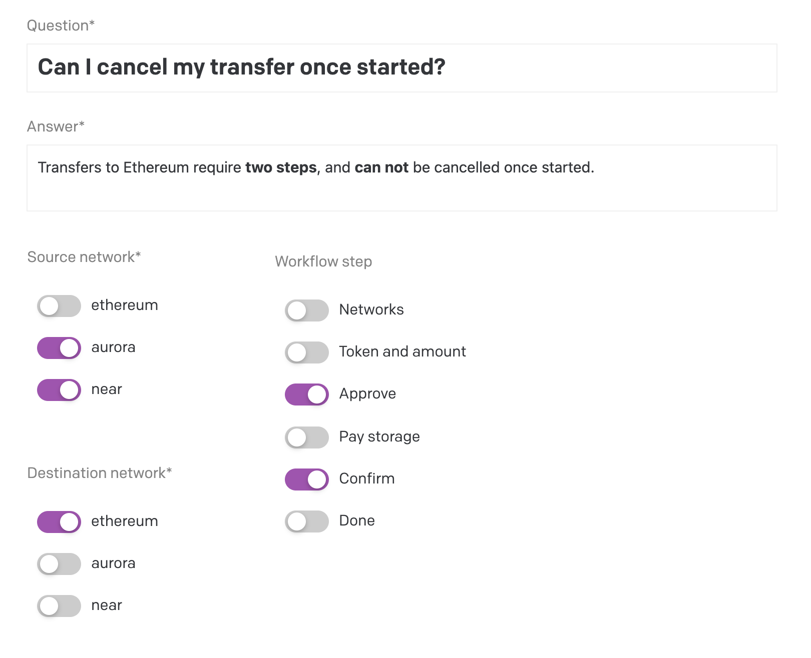
This structure will allow us in the future to extend the information displayed in the UI as we identify additional frequently asked questions from our users, and just in the places where its relevant.
The end goal, of course, is a product that is self-documenting, and needs no user manual!
Automatic MetaMask management
Multi-chain DeFi users are used to the terrible user experience of apps asking them to "Please switch to the Ethereum network", or worse, having to manually add a new network (RPC endpoint) to MetaMask. Yuck!
Our vision of the future is one in which users hop from app to app, unaware of the underlying network. In that world, wallets will come pre-configured with popular networks and automatically switch between them when needed.
In the meantime, since MetaMask is the defacto standard, we can make some progress in that direction by having the bridge interact with and manage MetaMask directly on behalf of the user.
In the following video, I don't have the Aurora network configured in MetaMask. As you'll see, the bridge will initiate a prompt in MetaMask to pre-configure and confirm adding Aurora, and then switch to it as the default network.
New transfer details
In the next video, we'll walk through a new transfer, from the Aurora network to the Ethereum network, in which you'll notice the following details:
- On the first screen, we show a context-specific FAQ informing the user that we currently only support the MetaMask and NEAR wallets.
- On the second screen, while MetaMask is reading the network and user-wallet status (which can take a few moments), we show some ghosted token placeholder icons, until we have the data necessary to show real token icons for just those tokens for which the user has a balance.
- Of course, we also provide a link to show the user all tokens that the bridge supports, and on that screen we gray out all tokens for which the user does not have a balance (since they can not be selected).
- We show the user their token balance on the destination network, as this is often useful in calculating how much needs to be transferred.
- We provide a one-click helper to allow the user to send their full token balance in the transfer.
- ...and in the case that they've chosen ETH, we show them a warning that they may want to keep a bit around for gas fees!
Pending and historical transactions
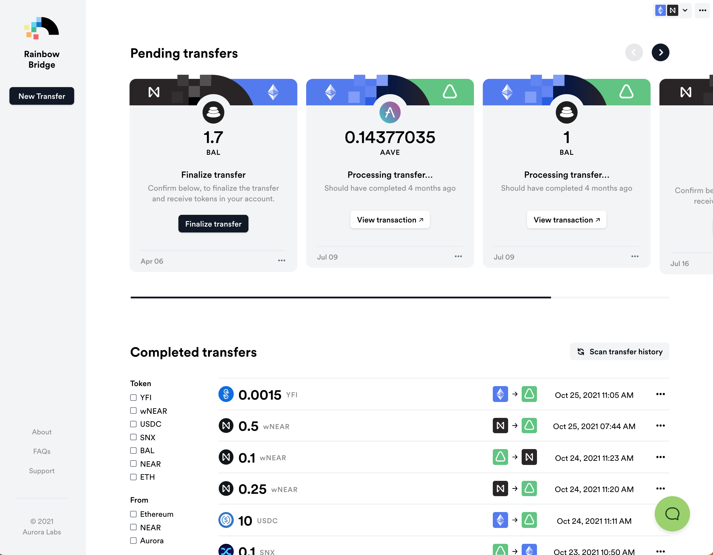
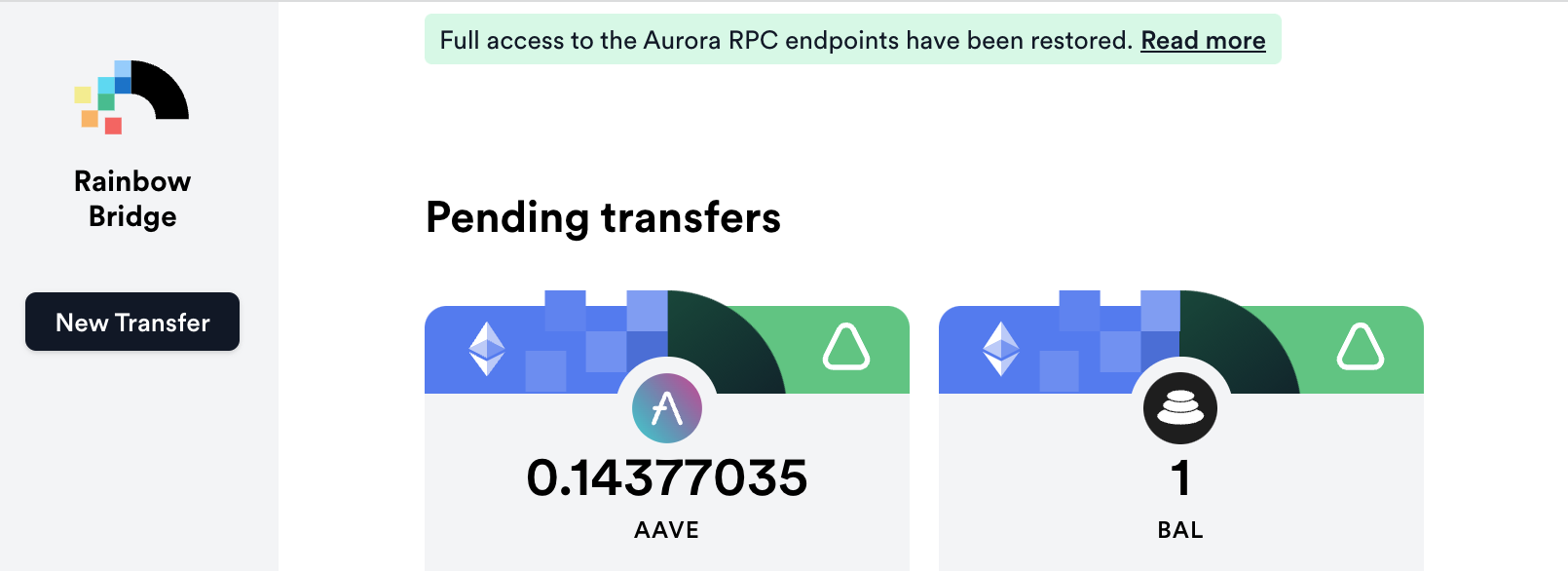
There's a lot to pack into the main screen where transactions are shown, and equally many design details and considerations:
- We visually separate pending from completed transactions, to draw the user's focus to those transactions that need attention.
- For pending transactions, we visually indicate the transfer direction (including a slight animation that's not apparent in the screenshot).
- We allow the pending section of the screen to scale and scroll horizontally. Here you can see that I have one transaction requiring finalization, and three that should have been completed, but still remain pending.
- For completed transfers, we emphasize the token icons and amounts, and visually indicate the direction of transfer.
- We alway ensure making a new transaction is readily available in the upper left.
- We provide customer support through direct integration with HelpScout. A user can create a support ticket directly in the Rainbow Bridge by clicking the icon in the lower right corner.
- And, of course, all this works gracefully on mobile devices!
Post-transfer conveniences
Great user experience doesn't stop after the transfer is completed. In the following video, you'll see that we've added convenience functions for:
- Viewing the source transaction in an explorer.
- Copying the transaction ID of the source transaction.
- Copying the contract address of the token on the destination network.
- Adding the destination token to MetaMask, so that it appears in the asset list.
- Finally, hiding a transfer. Sometimes, as in my own case here, there are transactions that will forever appear pending on the blockchain, and I'd like to simply remove them from the bridge UI. This feature allows me to do just that.
Transaction filters
For a multi-chain product like Rainbow Bridge 2.0, that allows transfers with up to six different direction combinations, you're going to need some filters to quickly find that historical transaction you're after. On that, we've got you covered!
Status communications
Sometimes issues come up that interrupt the smooth operation of the bridge, such as the recent DDoS attack. In order to keep the users up to date, we implemented a status page driven by the CMS, on which we display the full-text of the latest update, and zipped-up (but expandable) summaries of all past updates.
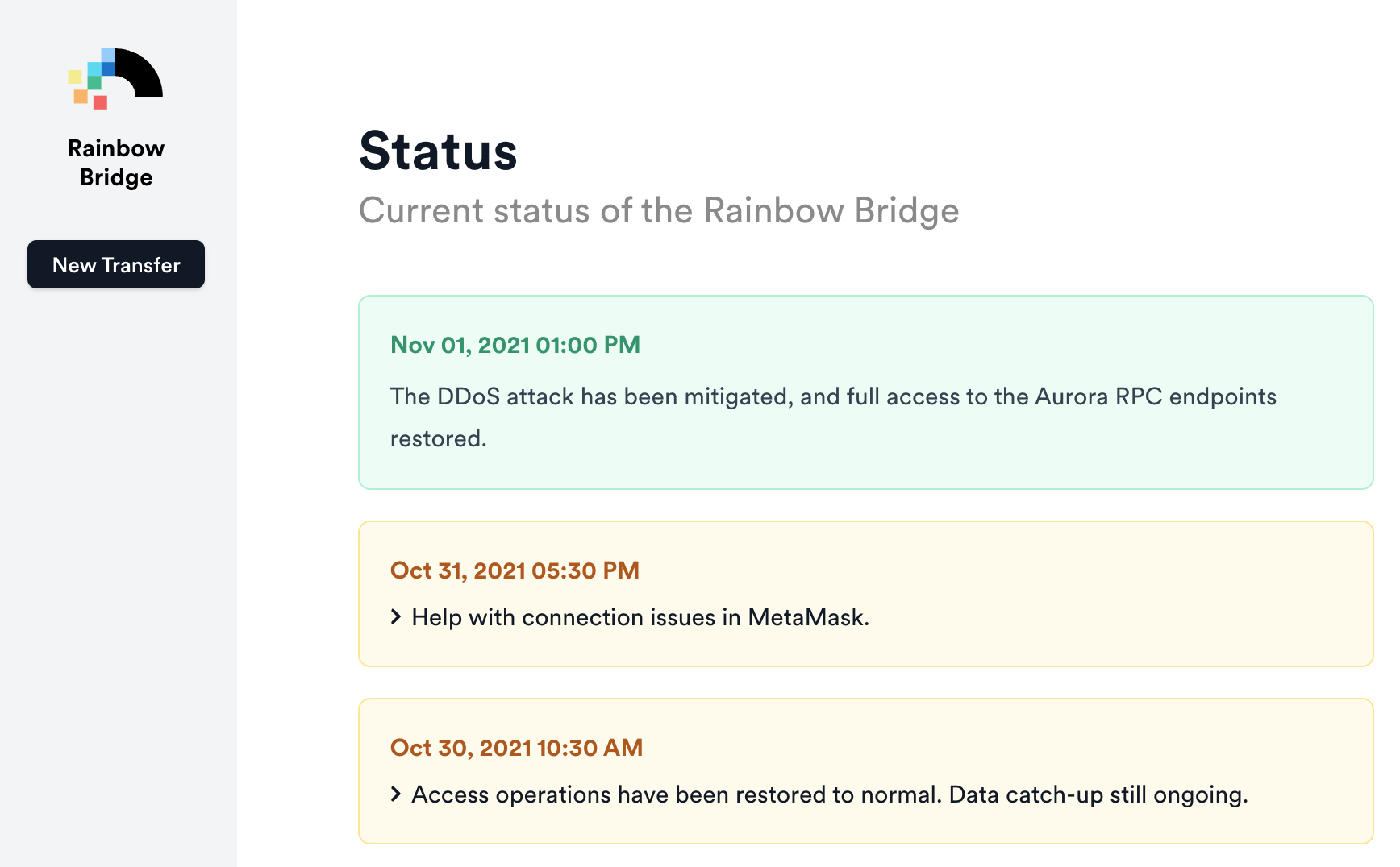
Whenever there's a status alert—which can be red (alert), yellow (warning) or green (all good)—we display a colored banner in the header throughout the entire bridge UI.
One interesting design challenge is what to do with green status updates, which are generally used to announce that some past issue has been resolved. Should we display them like other banners? You wouldn't really want a green banner permanently displayed.
Our solution was to engineer the UI such that green banners are displayed only for 24 hours, and then disappear from main UI (but remain on the historical status page).
Conclusions
UX is what will bring crypto to the masses, and we're really proud of the new Rainbow Bridge 2.0, and hope we've pushed the user experience of the crypto bridge a few steps forward in the industry.
But we're not close to being finished. We've got lots of new features planned, including some industry firsts! And, of course, we'll be observing and listening to our users in an effort to continually polish the experience.
We hope you enjoy using the Rainbow Bridge 2.0, and if you have any feedback give us a shout-out on Twitter or Discord!
